Logo Re-Design
This project focused on redesigning the logo for Three Sisters, a bakeshop in Ottawa. The goal was to elevate the brand’s identity by creating a more polished and professional logo, while still preserving key elements of the original design, such as the name and illustration. Alongside the new logo, a comprehensive brand guide was developed to outline usage guidelines, applications, and mockups, ensuring the client has a clear reference for consistent branding.
The project made use of design tools including:


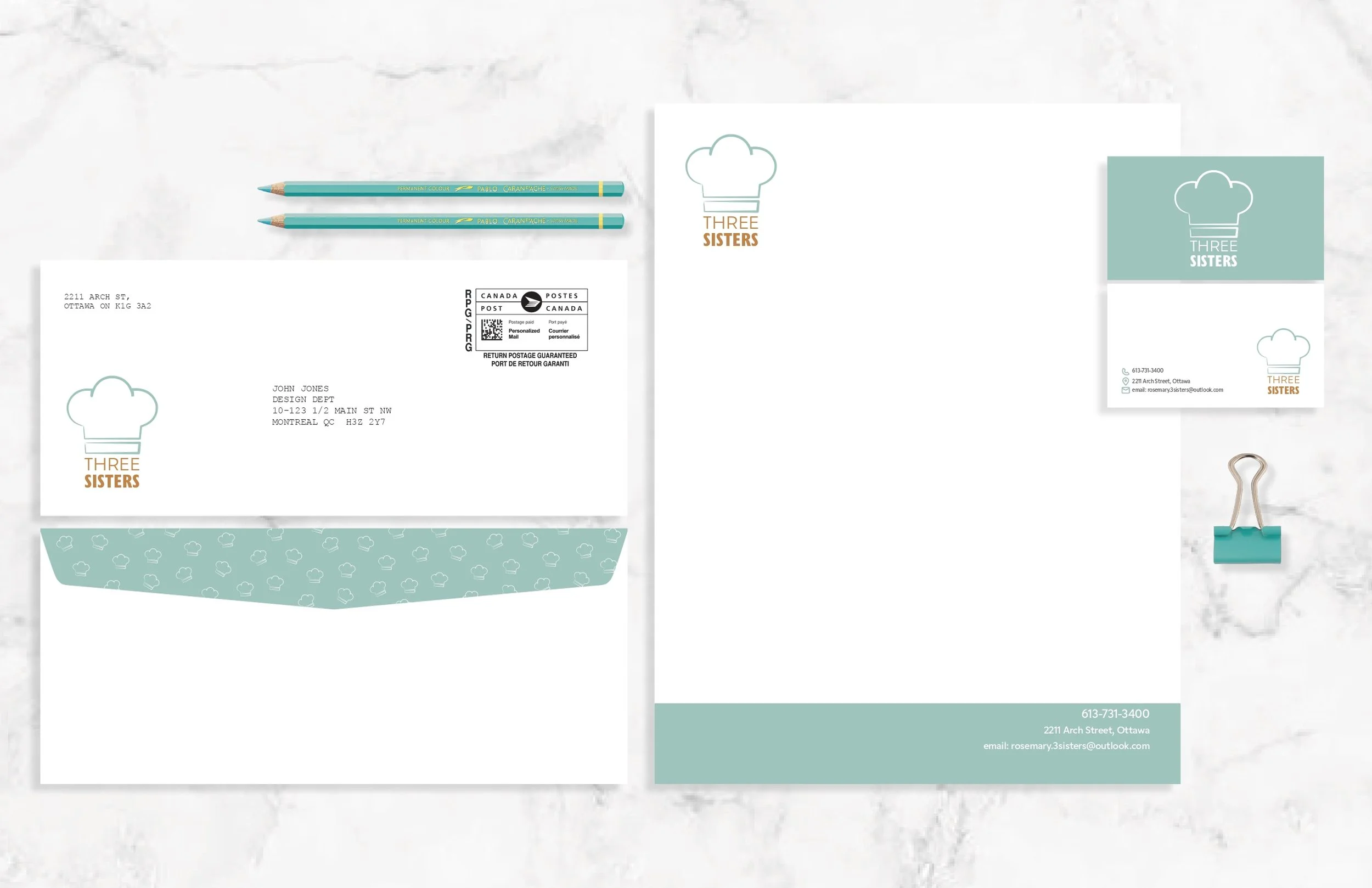
Mockup to showcase the logo
The original logo had a playful, childlike feel, so the design request centred on creating a more refined and professional look without losing the brand’s essence.
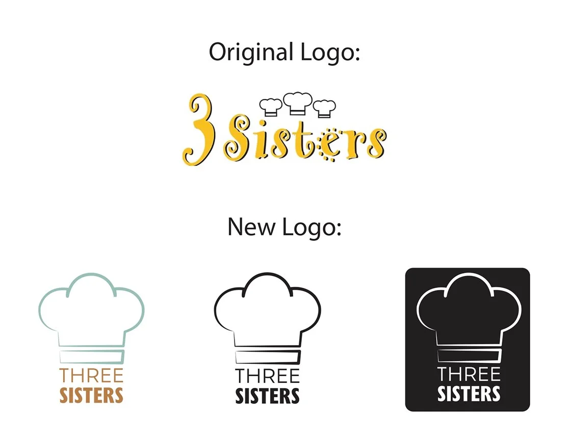
Original logo on top and the redesigned logo on the bottom, including the coloured, black and white, and reversed black and white versions
The process began with market and competitor research, supported by a creative brief. Ideation included the development of a mind map, mood board, and multiple sketching rounds. From there, the strongest concepts were refined into visual designs, with explorations of colour and composition. After selecting the final design, further adjustments were made to perfect it, followed by the creation of the brand guide to present the complete brand.
I decided to keep the chef’s hat as the central illustration in the logo, but instead of using three, I simplified it into a single, larger hat. This made the design cleaner, less crowded, and more impactful. I also refined the typography, choosing a font that felt more professional and easier to read. The colour palette was updated to reflect the bakery’s identity in a way that feels modern, clean, and welcoming.
Through this project, I strengthened my skills in branding and Illustrator, developing multiple design solutions that aligned with the brand’s personality, while also considering competitor research and the target audience.
Feedback highlighted that the redesigned logo successfully looked more professional, clean, and elegant, while still preserving the essence of the original identity.
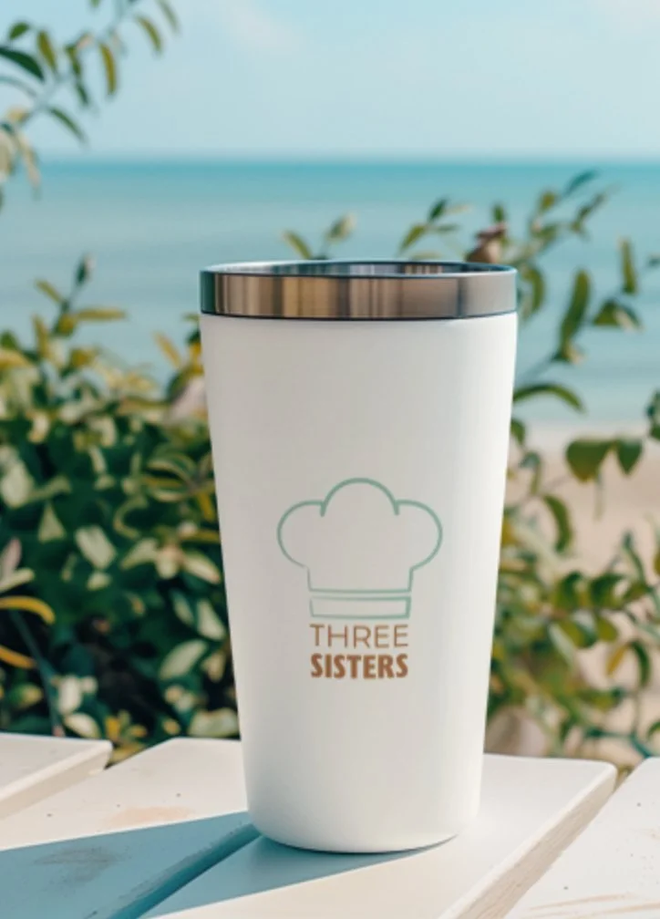
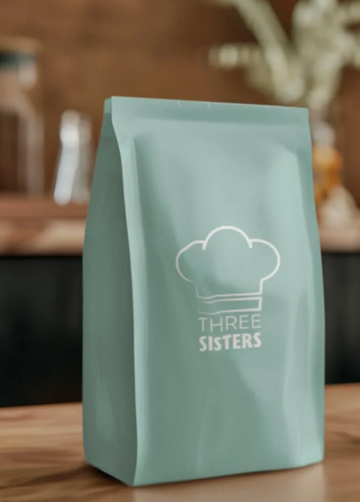
Mockup to showcase the logo
If I revisited this project, I would refine the line work of the illustration, slightly thickening thinner areas for better visibility and balance.
Ultimately, this project confirmed my passion for branding. It taught me how valuable research is, how to use feedback effectively, and how every detail (typography, colour, spacing) works together to create a strong and meaningful brand identity.