Product Design
This project involved creating a beer can label for The Bicycle Brewery, inspired by a theme that represents Ottawa. After researching local symbols and visual references, I developed a moodboard, explored multiple sketches, and refined the concept through mockups. This process ensured the client had a clear vision of the final design from concept to completion.
The project made use of design tools including:


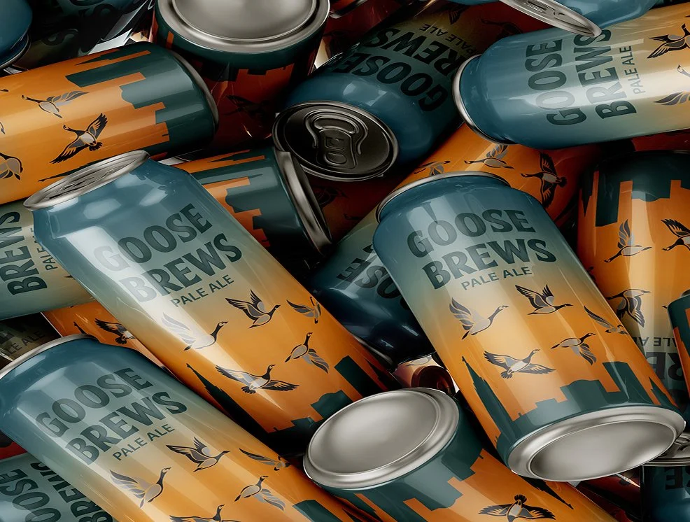
Mockup to showcase the product
The process began with researching different breweries and selecting one to focus on. Ideation included creating a mood board and developing multiple rounds of sketches. From there, the strongest concepts were refined into visual designs, exploring colour, layout, and composition. Once the final direction was chosen, it was further refined and perfected before creating a physical mockup. To showcase the finished product, a series of presentation mockups were also produced.
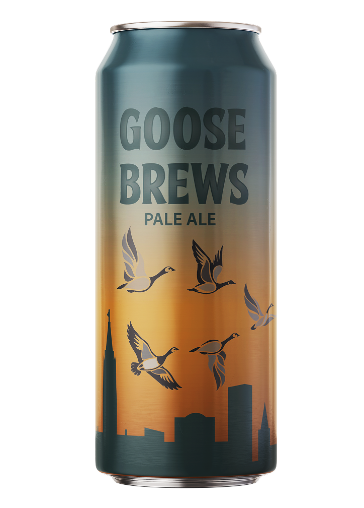
I chose to base the can design on the iconic Canadian goose, featuring a flock in their recognizable V-formation as the central illustration. To complement this theme, I incorporated a warm sunset and the Ottawa skyline in the background, creating a strong sense of place. Clean, legible typography was added to ensure clarity and balance within the overall design.
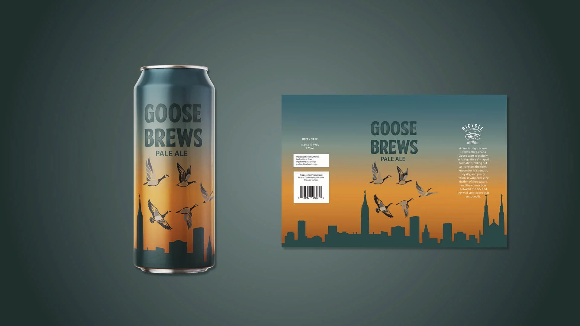
Flat design on the right, design on can on the left
I decided to keep the chef’s hat as the central illustration in the logo, but instead of using three, I simplified it into a single, larger hat. This made the design cleaner, less crowded, and more impactful. I also refined the typography, choosing a font that felt more professional and easier to read. The colour palette was updated to reflect the bakery’s identity in a way that feels modern, clean, and welcoming.
Through this project, I strengthened my skills in branding and Illustrator, developing multiple design solutions that aligned with the brand’s personality, while also considering competitor research and the target audience.
Feedback highlighted that the redesigned logo successfully looked more professional, clean, and elegant, while still preserving the essence of the original identity.
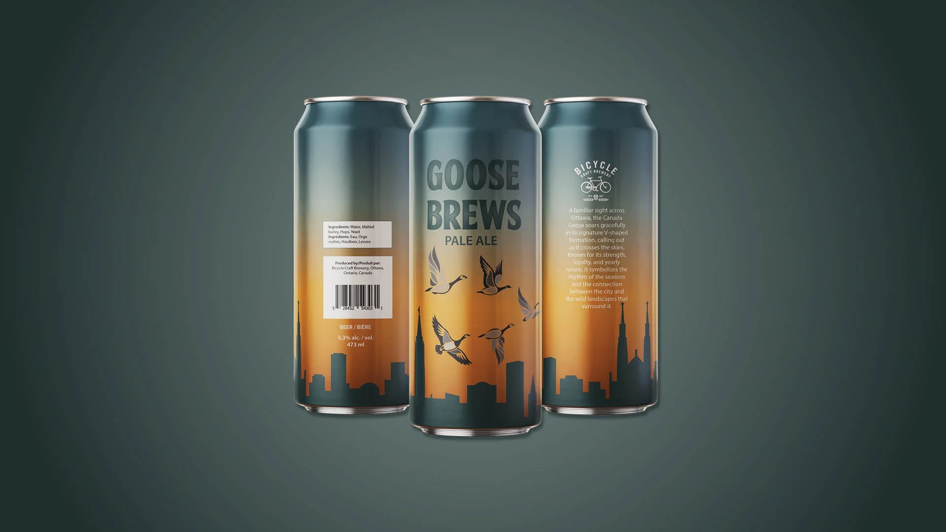
Mockup to showcase all the sides of the design. Barcode and important information on the left, beer name and main illustration on the middle can, and brewery logo and story on the left can.
Ultimately, this project helped me discover how much I enjoy product design. It taught me the importance of following technical requirements, such as proper barcode placement, while also ensuring that illustration and typography work together in a balanced and cohesive way. It strengthened my ability to blend creativity with practical design standards.