Product Re-Design
For this project, I selected an existing product and redesigned its packaging. The task included creating a new package concept, developing the graphic design, selecting colours and typography, building a prototype, and finally, presenting the finished work in a poster with photos and key information.
The objective was to design packaging with a unique attribute, something distinctive and uncommon, that would present the product in a more engaging and creative way.
The process began with market research, analyzing current packaging trends, competitors, and the target audience. During the ideation stage, I created a mood board, produced sketches, and developed concepts. For execution, I refined the visual design, produced die lines, built a prototype, and captured photos of the final package.
The project made use of design tools including:

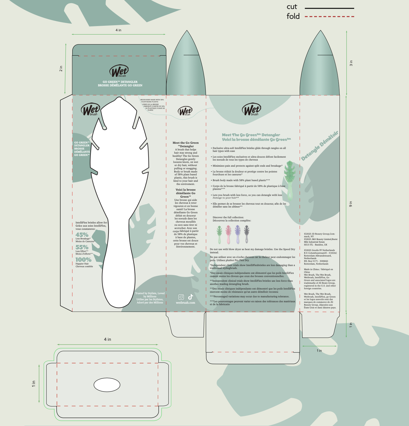
Flat illustration of die cut
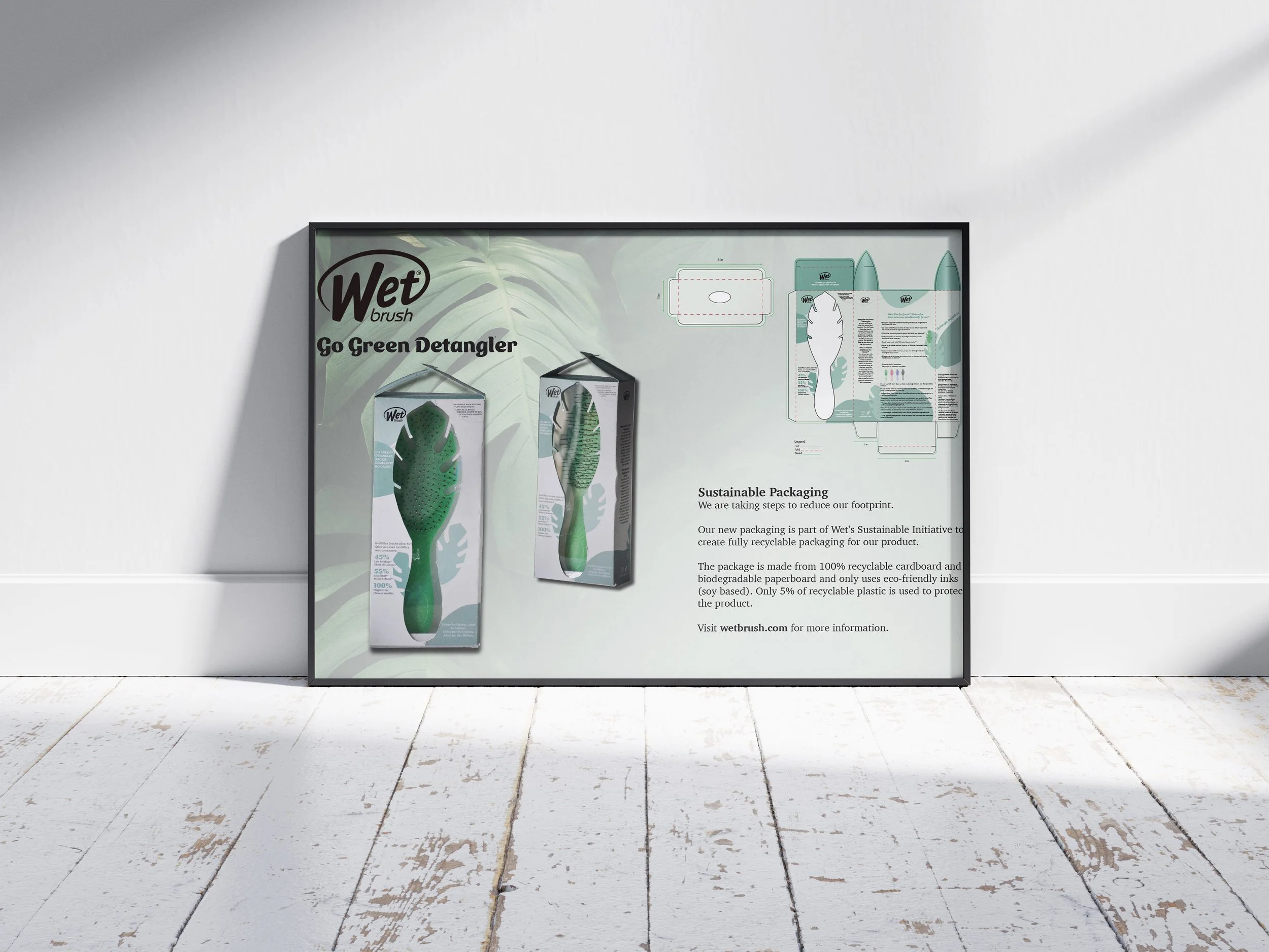
I decided to keep the rectangular box format with a transparent window to showcase the product, but redesigned the cutout to match the shape of the brush. This allowed customers to see the full product while adding a protective plastic layer for safety. To enhance the visual appeal, I incorporated leaf elements, two at the top and green leaf shapes throughout the design, to create a cohesive, nature-inspired theme. The poster was also designed to reflect this look, featuring matching fonts, colours, and leaves in the background.
I decided to keep the rectangular box format with a transparent window to showcase the product, but redesigned the cutout to match the shape of the brush. This allowed customers to see the full product while adding a protective plastic layer for safety. To enhance the visual appeal, I incorporated leaf elements, two at the top and green leaf shapes throughout the design, to create a cohesive, nature-inspired theme. The poster was also designed to reflect this look, featuring matching fonts, colours, and leaves in the background.
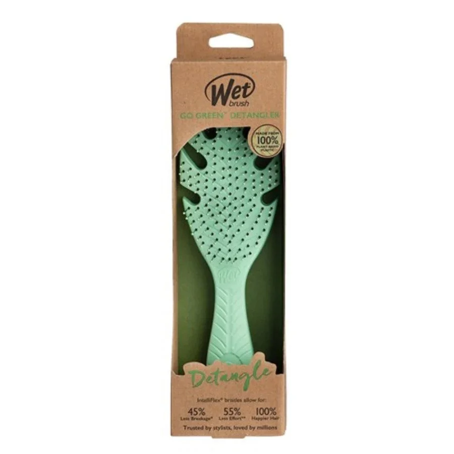
Original package
This project helped me strengthen my creative and problem-solving skills, particularly in finding packaging solutions that are both unique and functional. It also allowed me to further develop my technical skills, especially in creating and refining die lines.
Feedback highlighted that the package design was creative, visually appealing, and well thought out, with colours and illustrations that complemented the product. The poster also got good feedback for looking professional and cohesive with the packaging design.
If I were to revisit this project, I would adjust the placement of the transparent window so it sits slightly higher, avoiding visibility of the box’s interior base. I would also refine the leaf details at the top to make them look more polished and intentional.
Overall, this project taught me that I enjoy packaging design, especially the creative exploration of layouts and visual identity. At the same time, it confirmed that die line creation is not my favourite part of the process. My favourite aspect was designing the poster, which deepened my appreciation for layout design and how it ties everything together.